
In today’s fast-paced world, almost everyone accesses the internet through their mobile devices. With this shift to mobile technology, businesses must unlock new ways to optimize their online presence across different platforms.
Mobile optimization is not just a fad; it has become an essential factor for any company looking to stay relevant and competitive in the digital marketplace. The key question in every marketer’s mind is how they can improve their mobile strategy.
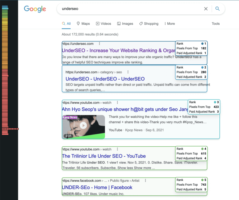
The solution lies in leveraging search engine optimization (SEO) analytics that can provide valuable insights into your site’s performance on mobile devices.
In this article, we’ll explore why SEO analytics are crucial for unlocking successful mobile optimizations and boosting your overall digital marketing efforts.
Understanding Mobile User Behavior for Better Optimization
Mobile optimization is a crucial aspect of any business’s digital strategy. Understanding mobile user behavior can help companies optimize their online presence to better serve their audience, increase engagement and ultimately drive conversions.
When it comes to optimizing for mobile devices, SEO analytics can be incredibly valuable in providing insights into how users interact with your website on different devices.
Marketers must understand that not all users are the same when it comes to accessing the internet through mobile devices. Users have diverse habits and preferences when using different platforms such as smartphones, tablets, or iPads.
Therefore, businesses should take into account these variations and create customized experiences for each device type based on individual needs.
Mobile optimization should be an ongoing process as user behavior evolves with changing technology trends across markets.
By keeping up with those changes backed by data-driven insights from SEO analytics, businesses can improve their overall marketing ROI while effectively reaching their target audience at maximum potential impact points on the go- making mobile optimization more important than ever before.
Mobile Site Speed: Why It Matters and How to Improve It
When it comes to optimizing your mobile strategy, one of the most critical factors is site speed. Mobile users expect fast load times and quick access to information. If your website takes too long to load on a mobile device, visitors are likely to abandon it and move on to a competitor’s site instead.
Research shows that more than half of all online shoppers will leave a website if it takes longer than three seconds to load. To avoid losing valuable traffic and potential sales, businesses must prioritize their website’s mobile performance by focusing on improving its loading speeds. There are several ways you can boost your site’s mobile speed metrics without compromising quality or design.
The first step is streamlining your code and compressing images for faster loading times. Secondly, simplify navigation by removing any unnecessary elements that could slow down page load time or detract from the user experience.
Lastly, leverage SEO analytics tools like Google Analytics or GTmetrix for data-driven insights into how your site performs across various devices and networks in real-time analysis.
By prioritizing these practices in your ongoing optimization efforts with an emphasis on monitoring metrics regularly; you’ll unlock significant improvements in overall search visibility whilst concurrently building an engaging experience for customers irrespective of how they find themselves viewing content- be sure not only consider traditional desktops but also tablets & smartphones where over 50% which cannot be ignored!
Crafting Compelling and Relevant Mobile Content
Crafting compelling and relevant mobile content is crucial to reaching your audience on their preferred platform. With the majority of internet users accessing the web through mobile devices, it’s essential to create content that caters specifically to these platforms.
This means using responsive design principles, creating bite-sized pieces of information, and avoiding long blocks of text.
When crafting mobile content, it’s important to keep in mind that people use their phones differently than they use desktops or laptops. Mobile users are often multitasking or on the go, so your content needs to be easily digestible and quickly scannable.
Additionally, you should consider how your target audience interacts with their mobile devices; do they primarily use social media apps? Are they more likely to browse news websites or watch videos?
Ultimately, crafting compelling and relevant mobile content comes down to understanding what your audience wants and delivering it in a way that is accessible and engaging for them.
By leveraging data from SEO analytics tools, you can gain valuable insights into trending topics and keywords while also monitoring user behavior on different platforms. With these insights in hand, you can tailor your content strategy accordingly and ensure that you’re providing real value for your audience at every touchpoint.
The Importance of Responsive Design in Mobile Optimization
Mobile optimization has become a crucial part of any digital marketing strategy, and responsive design plays a significant role in achieving optimal results. With the increasing number of people using mobile devices to access websites, businesses need to ensure that their website provides an excellent user experience on all screen sizes.
Responsive design allows a website’s layout and content to adjust automatically based on the device being used to view it. One major benefit of responsive design is improved search engine rankings.
Google has made it clear that mobile-friendliness is one of the factors taken into consideration when ranking websites in search results pages. This means that having a responsive website can help improve your business’s visibility and reach more potential customers who are searching for products or services online.
In addition, incorporating responsive design into mobile optimization can increase conversion rates by making sure that users have a seamless experience across different devices.
Whether they’re browsing through their desktop computer or using their smartphone on the go, visitors should be able to easily navigate your site and find what they’re looking for without any frustrating obstacles preventing them from taking action.
By prioritizing responsive design as part of your overall mobile optimization strategy, you’ll be setting yourself up for long-term success as more consumers shift towards using mobile devices for online activities.
Mobile-Friendly Navigation: Making Your Site Easy to Use on Any Device
A crucial aspect of mobile optimization is the navigation of your site. With a smaller screen and no mouse or keyboard, it can be challenging to navigate through menus and pages on a mobile device.
Mobile-friendly navigation refers to structuring your website in such a way that makes it easy for users to find what they’re looking for quickly.
This includes using simple yet descriptive labels, reducing clutter on pages, and ensuring that buttons are adequately spaced out. Implementing mobile-friendly navigation not only enhances the user experience but can also improve your website’s SEO ranking.
Google has emphasized the importance of providing quality user experiences as part of their algorithm updates, which means prioritizing a mobile-first approach in web design is critical. A well-optimized site ensures that your visitors stay engaged longer and increases the likelihood that they will return in the future.
Overall, optimizing your site for mobile devices requires careful consideration of how users interact with different interfaces. By prioritizing ease of use and leveraging SEO analytics to continually improve functionality, websites stand a better chance at attracting desirable traffic while keeping ahead of competitors’ strategies.
Leveraging Google’s Mobile-First Indexing for Better SEO
In the digital age, websites that are not optimized for mobile devices will be left behind in cyberspace. Google’s Mobile-First Indexing offers businesses a golden opportunity to improve their online presence and expand their reach.
By prioritizing the mobile version of a website over the desktop version, Google has given weight to mobile optimization like never before.
To leverage this new indexing method, marketers need to create content that is specifically designed for small screens with different resolutions and capabilities.
This means keeping load times low and designing navigation systems that work well on touchscreens. Through SEO analytics, marketers can identify how users interact with their site on different devices as well as uncover hidden growth opportunities.
By optimizing pages for mobile search queries using proper keywords and incorporating high-quality media such as photos or videos, companies can rank higher in search engine results pages (SERPs), increasing visibility and driving more traffic to their website – ultimately resulting in greater conversions revenue growth.
With these tactics combined with creative design decisions aimed at enhancing user experiences on phones rather than desktops alone, businesses can unlock untapped potential while improving user engagement across all platforms.
Measuring and Analyzing Your Mobile Optimization Efforts
Measuring and analyzing your mobile optimization efforts is crucial in today’s digital age. The first step is to identify key metrics that matter to your business, such as page loading time, bounce rate, conversion rate, and user engagement.
Once you have established a baseline for these metrics, you can start testing different strategies for mobile optimization and track the impact on performance using web analytics tools.SEO analytics can provide valuable insights into how users search for your products or services on mobile devices.
You should pay attention to which keywords people are using to find you through search engines like Google or Bing. This insight can help inform your content strategy by targeting high-potential keywords that are relevant to your business.
In summary, measuring and analyzing the effectiveness of your mobile optimization efforts requires a data-driven approach focused on identifying important metrics and understanding customer behavior through SEO analytics.
By leveraging these insights into site traffic trends, along with consumer needs and preferences uncovered via keyword research or other marketing channels like social media platforms (e.g., Facebook), businesses can unlock new opportunities for success in today’s competitive digital environment where smartphones reign supreme!